DJ G Sharp
Date
July 20, 2020
Category
Graphic Design, Logo DesignAbout This Project
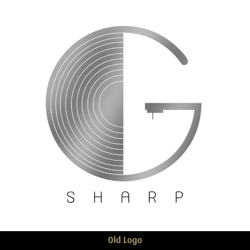
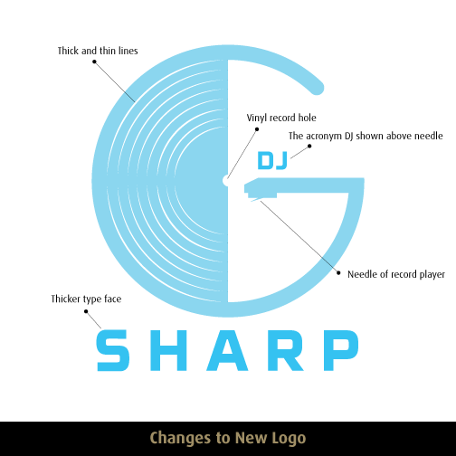
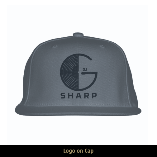
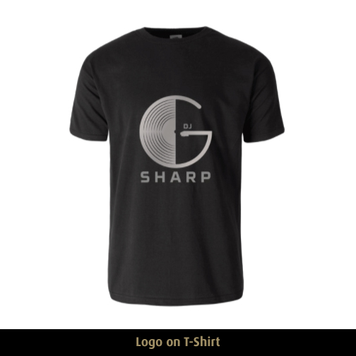
DJ G Sharp is a reputable DJ in Chicago. This graphic design project was to revamp his old logo I designed several years ago. The client did not want to part away with the main element of incorporating a record within the letter G. The design changes included; adding stylized lines on the record that gives a sense of motion; adding “DJ” at the top next to the needle; changing the needle to be more realistic; inserting part of the hole where you place the record, and choosing a font that gave a more old school appeal yet will still display clearly if reduced significantly printed on a promotional flyer.


